Hello Blog,
There are so many things I could have written this post about, but there is one thing I can't get out of my head about the film opening project: I can't decide which font I'm going to use.
There are so many important elements in a film opening, but recently I've found that the font used for the title can set the entire mood for a production. The font can set up the tone of a film and give the audience something to expect. There are so many iconic film titles that fit so well with the overall mood of the film, here are some examples:


Each of these fonts fit the theme of the movie perfectly. These titles have helped define the brand for these movies an define a whole franchise for their movies. A title is the first thing the audience connects to a film. It helps reel in a target audience, Fonts can be used to appeal to an audience, be part a brand for the movie, and it can even reflect on themes from the movie. It's so important what font is used because this can help further develop a production.
After much thought, I thought that since my group and I are thinking of doing a coming-of-age film opening, we should use a font that matches that theme.
Below are some options I would like to use:

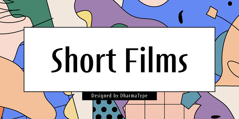


While these fonts are pretty simple, I feel that whichever title my group and I end up deciding on should be pretty simplistic while still fitting into our chosen genre to reel in our target audience which will most likely be young adults. The font shouldn't be too flashy since the film itself is supposed to be lighthearted.
I will keep you posted on which font my group ends up using!
Until next time!
.png)


.jpeg)
No comments:
Post a Comment